Building a shared language for a fast-growing crypto casino
FortuneJack is the world's first crypto casino and one of the top 10 globally. This project was a complete design system, built from scratch — a shared language that unified a growing team and transformed how design and development worked together.
Business goals
Eliminate visual inconsistency across the entire platform.
Speed up the design-to-development handoff process
Create a shared language between designers and developers.
The starting point
Before this project, FortuneJack had almost no design foundation. I started by mapping exactly what existed — and the gaps were significant.
Only three components existed — a primary button, a secondary button, navigation, and a dropdown. Everything else was rebuilt from scratch every time.
No tokens of any kind — no color variables, no spacing scale, no typography styles. Every value was hardcoded and undocumented.
Handoff stretched across two to three days per feature — most of it back-and-forth clarification of ambiguous specs, not actual building.
From scattered decisions to a single system
A deliberate process, built with the people who would actually use it — designer to designer, then designer to dev team.
Audit
Naming system
Components
Handoff
A naming system everyone could read
Simplicity starts with language. A system only gets adopted if everyone can read it without a manual — so the naming had to work for designers and developers equally. Token naming looks like a detail. It isn't.
After several sessions with both designers and all developers, we landed on a four-part structure that reads like a sentence.
Element
What it styles
Background
text
stroke
icon
fill
Tone
What it communicates
neutral
brand
warning
danger
Emphasis
How prominent it is
strong
weak
weaker
State
When it applies
hover
pressed
focused
disabled
Element
Tone
Emphasis
State
The structure reads like a sentence:
what it styles → what it communicates → how prominent → when it applies.
A developer adding a hover state to a danger border never has to ask which token to use — the name already tells them.
Primary surface
Background
Neutral
Strong
Light success fill
Background
success
weak
Primary brand text
text
brand
strong
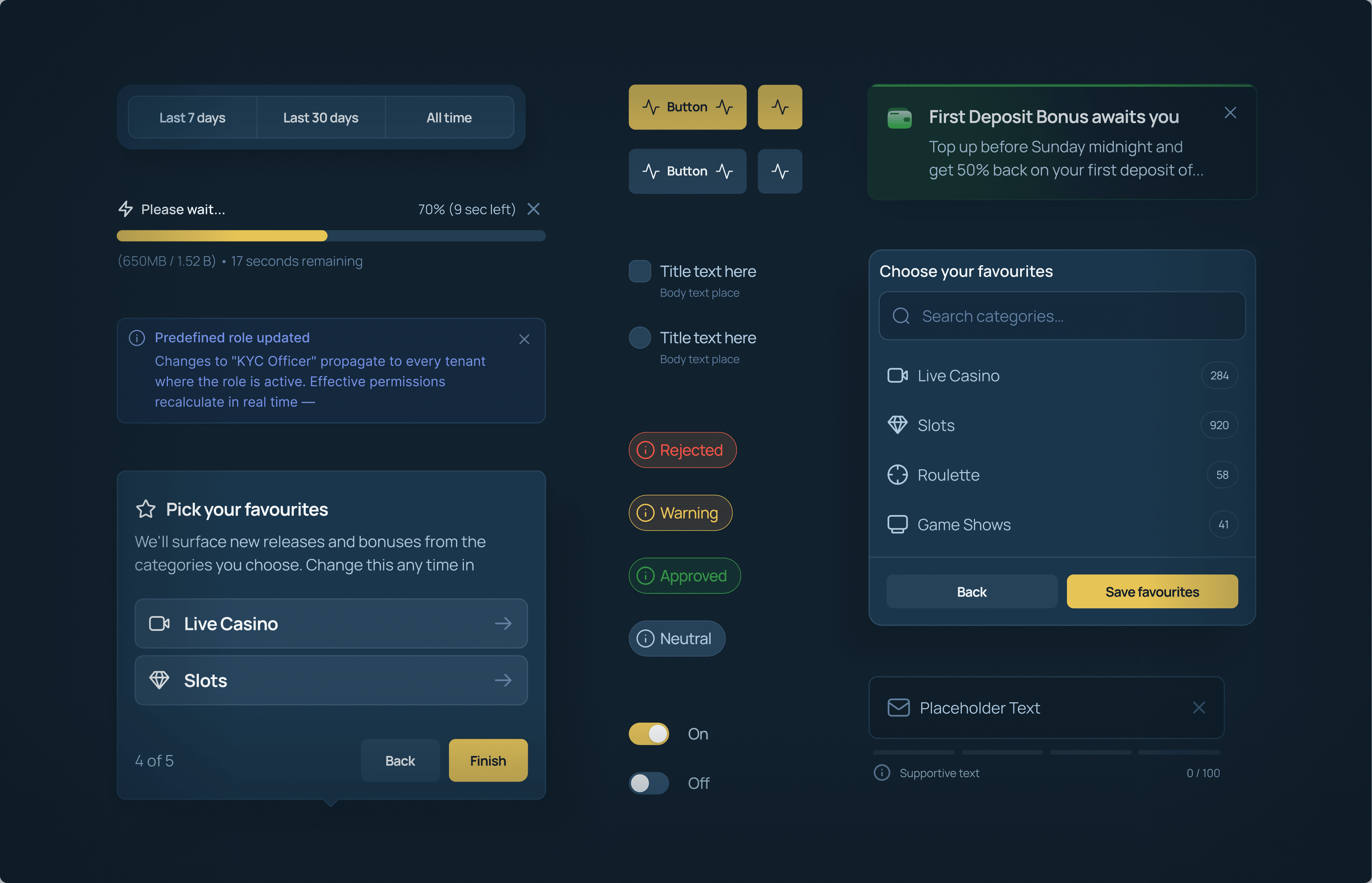
A library that covers every screen
A system only gets used if it has everything the team needs. With the foundation locked, we built out every interactive and structural element the product required — each with full states, variants, and Figma properties, so a designer assembles screens instead of inventing them.
Getting the team to actually adopt the system came down to two judgment calls — not technical problems, but decisions with real consequences either way.
A three-tier approach (brand → alias → mapped) is the standard recommendation for scalable systems — more granular control, more future flexibility. But applied to a single-brand product with one color mode, it would have added a layer of abstraction that served no purpose and made the system harder to learn. Choosing the simpler two-tier structure of primitives and semantics meant deliberately resisting "best practice" in favor of what was actually right here. That's a harder call than it sounds — it's easy to over-engineer when the more complex option is the one that looks safe.
The dev team was already productive with Tailwind and reluctant to switch. The risk was real: if they didn't adopt the system, every design decision would quietly get worked around until the system was ignored entirely. The solution came from empathy rather than authority — keep Tailwind's raw value scale as the foundation so migration felt familiar, while making the design identity fully custom. Neither side got exactly what they wanted. Both got something that worked, and adoption was painless.
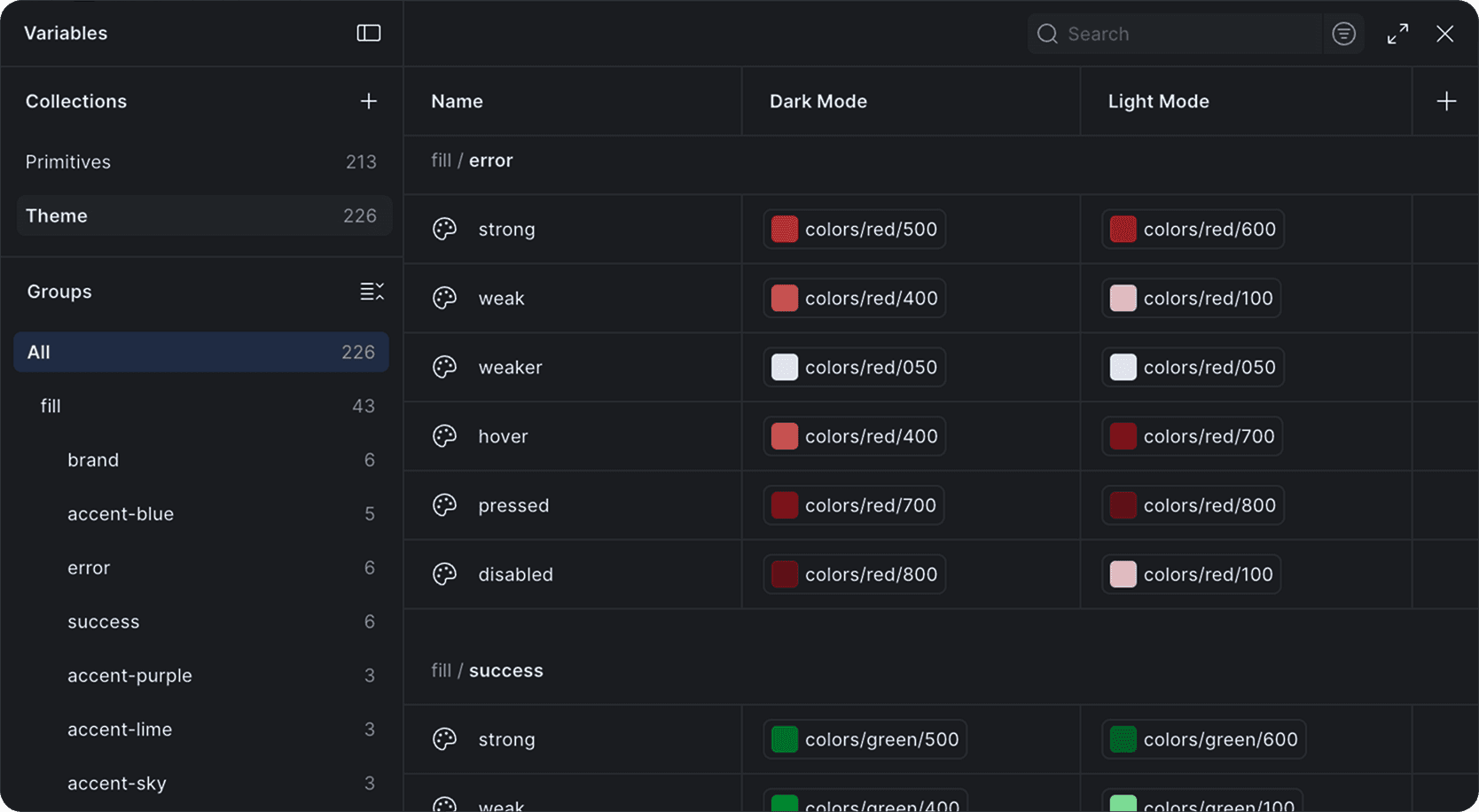
Two collections, 439 variables. Primitives hold the raw scale; Theme holds every semantic token that components actually reference. Each one aliases a primitive and resolves per mode — fill/brand/weak is slate/800 in dark and slate/100 in light. One name, correct value everywhere.


The library
Color, typography, and every component the product runs on — built once, with every state accounted for.


3× faster handoff
Developer handoff dropped from two to three days down to a single day.
What actually changed
Designer - developer
Constant back-and-forth
Zero misunderstandings after launch
How the team works
Everyone working differently
One shared source of truth
The product itself
Inconsistent across screens
Consistent at scale